Test Your WordPress Website on Different Devices
In this WordPress tutorial, we’ll explore how to easily check the responsiveness of your website using various tools, including the Google default inspect tool and the Mobile Simulator Chrome extension.
To check your website on various devices, simply use the Chrome default inspect element. For more options, you can also use a Chrome extension called “Mobile Simulator – Responsive Testing Tool.” Simply install the extension, and you can easily preview how your WordPress site looks on different devices, including tablets, Android devices, and more. However, please note that this Chrome extension also has some paid features.
Do give it a try and let us know if it has worked for you or not!


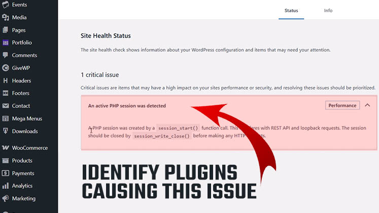
Identify Plugins Causing the Active PHP Session Error in WordPress
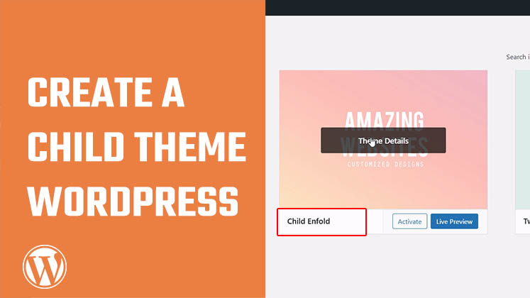
How to Create a Child Theme in WordPress
How to clear Cache from cPanel Hosting | Shared Hosting Server